DOLLS KILLS CART & CHECKOUT redesign
Partnered with the Product Manager to evaluate and propose a redesigned flow for both cart and checkout on the Dolls Kill website.
new experience
Slide-Out Cart
Stepped Checkout - Different experience for new and returning users.
old experience
Full Page Cart
Single Page Checkout - Same experience for new and returning users
details
why?
Optimize for Mobile - 60% of users are on mobile to browse but conversion was higher on desktop. Hoping to make an impact in this area
Issues with backend communication & architecture which caused speed issues, order errors and missing information
Cluttered and overwhelming visual experience
Needed to reevaluate payment options
New vs returning user experience was not considered
Certain user actions would prevent progress, clear fields, prompt unclear error messaging
Due to issues, Customer Service team hit with a large number of contacts per day, creating a long backlog
Inconsistent UI styling
high level PROCESS
Review current flow
Key Stakeholder feedback & Business goals established
Competitive Analysis
Considerations & Features
Establish Goals & Principles
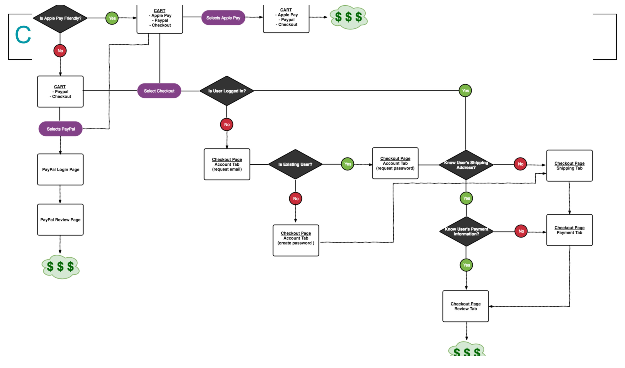
Chart out flow options & prototype recommendation
Finalize Flow
UI Exploration, research, identify pattern, comparison survey
High Fidelity designs & iterations
- Final Engineering Handoff - Jira Tickets, Redlines, Annotations
GOALS & PRINCIPLES
Mobile first
Declutter
Brand cleanup
- Speed
Flow Map
Key features
Apple Pay
Shipping Options
Promo Codes, Store Credit (and login)
Empty State
Action on Item Add
Account - Login Gate
Shipping info step
Payment info step
Order Review on Mobile
Editing Shipping/Payment
1 Click Checkout for returning users (review page)
iterations
Apple Pay integration
Swipe to open cart on mobile
BOGO Promotion methods
Free gifts
OOS products
Cart empty state graphics & messaging
Hover states
Cart Icon
Form style
Testing Shipping Method Visuals
Tests
Free Shipping
‘Bag’ vs ‘cart’
Visual shipping options


