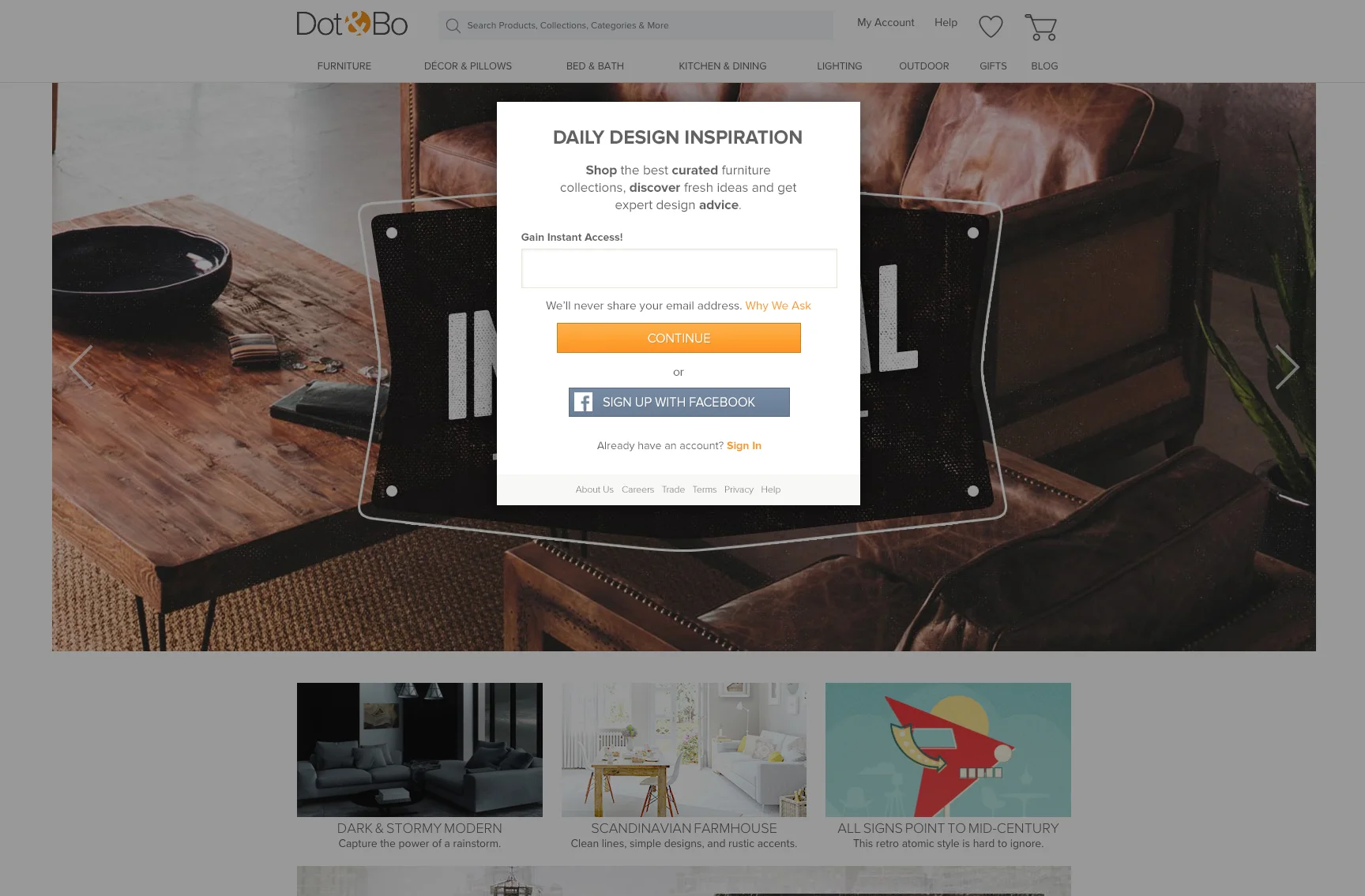
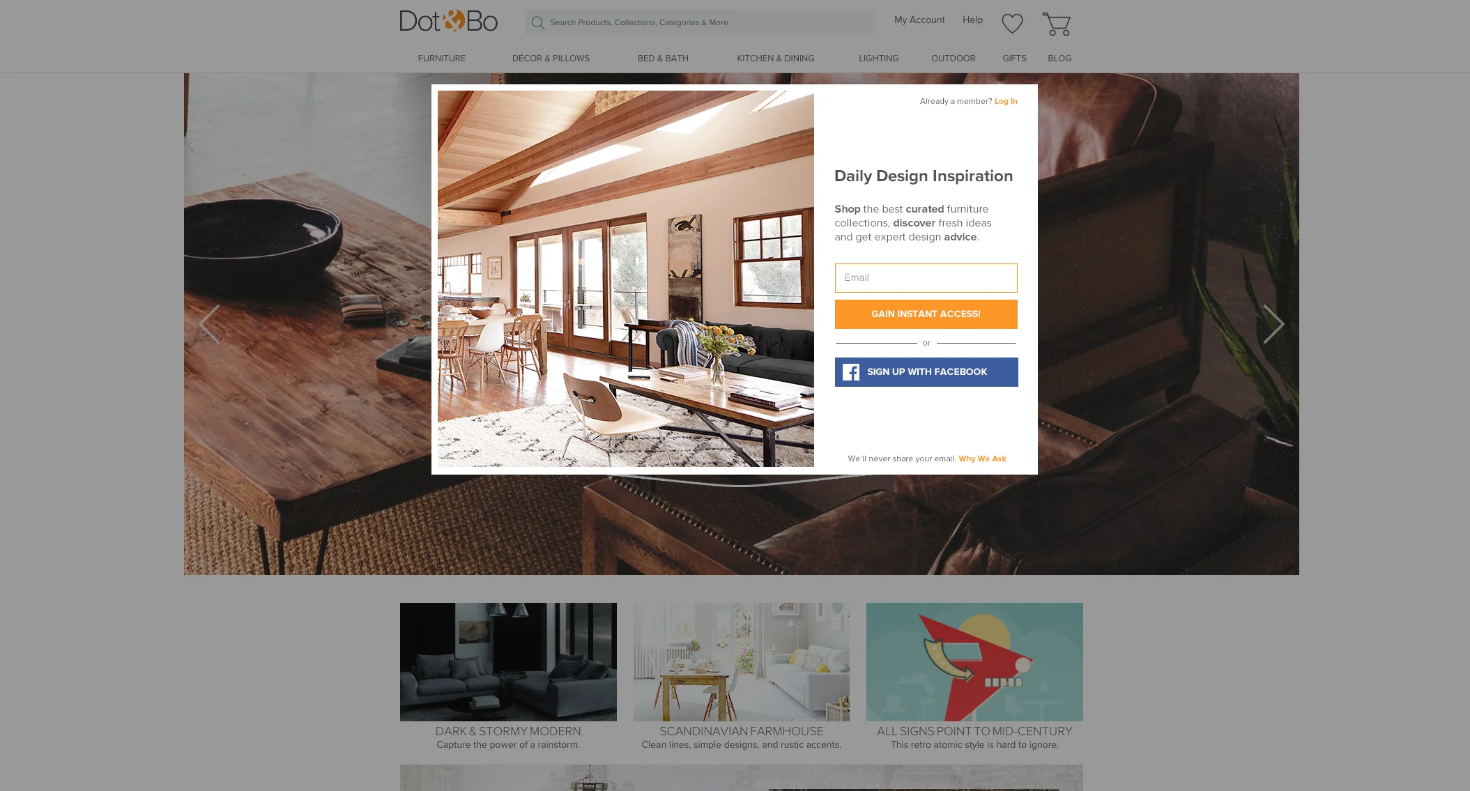
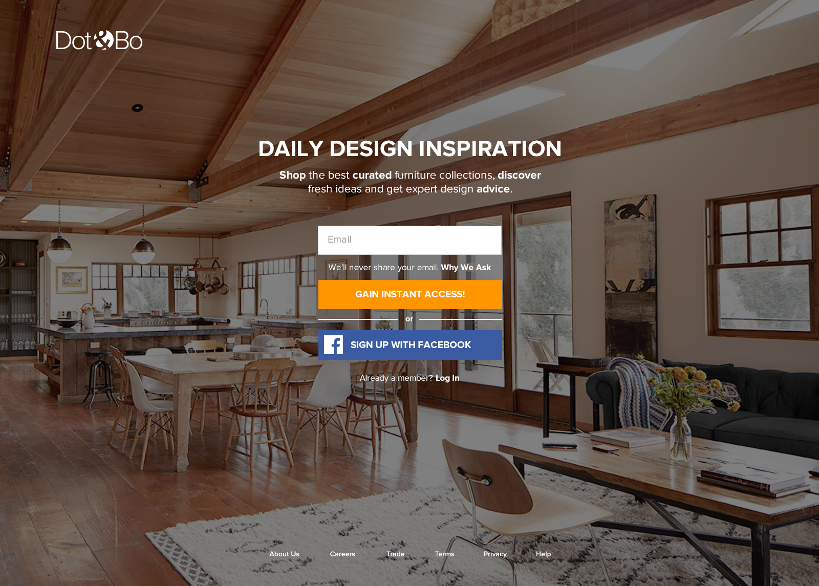
dot & bo sign up modal Tests
Below are some tests I performed of Dot & Bo's sign-up modal. The first iteration was to test copy using the current design. Then for the second iteration, I revamped the modal experience with a new layout. We tested this against the old layout but with updated copy. Finally, the third design is a full page splash sign-up that was again tested against the other options. We found that ultimately the original messaging that included discount message won. As for visually, the version of the modal with the image did not significantly prove to be better than the original layout.