dot & bo SITE HEADER & NAVIGATION
As Art Director, my task was to redesign Dot & Bo's website. Along with that, I felt there was a need to update the branding to a cleaner & simpler feel. I adjusted the logo to be the same height, simplified the ampersand and gave the characters some spacing to help it transition into a more modern aesthetic. The icons in the header needed some adjusting to flow better with the rest of the site. Finally, I gave more weight to the navigation categories so they matched the logo and stood out on the page more.
Below you will see a side by side comparison of my new header and the old one. Continue down the page to see the other edits that were made to the navigation menus.
new

Old

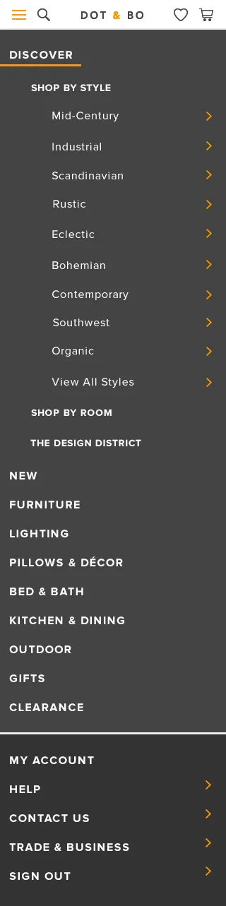
CATEGORY NAVIGATION MENUS
New
olD
TOP NAVIGATION MENUS
account DROP DOWN
Key account-related links plus invite friends & help center.
Favorites drop down
Features the 3 most recent products a user has favorited with a link to view all.
cart drop down
The idea of having a drop down when hovering over the cart icon is new for Dot & Bo - previously you had to just click on the cart icon to view your cart. This drop down will provide users with one less click to access this information.
cart drop down - more than 3 products
If a user has more than 3 items in their cart, the drop down becomes scrollable, so as to not take up too much of the screen. All products display their options, quantity, and subtotal.